Sheet music I Love The Bobbed-Hair Bimbos, by Zeph Fitz-Gerald (1923). Via.


The infamous “Hooker” cover of True Life Secrets #23 (1954), in which a woman responds to a man proffering jewels by saying, “…And just what I must I do to get those?”

I haven’t read the comic, but in my mind he’s merely trying to get her to remove all that horrid “Milwaukee Blue” eyeshadow.
Remember Wilson, the neighbor whose face we never completely saw as it as obscured by the fence on Tool Time? Yeah, so does the seller of this vintage photo — because they titled the auction “Unusual Vintage Photo View Mrs Wilson doing Laundry blocking her Face“. So unexpectedly delightful, I nearly snorted Diet Coke out of my nose. Which would only make more laundry for me.

These photos of Brigitte Bardot with the oval frame…


Remind me of the intro to The New Girl, with Zooey Deschanel.
Images via The Nifty Fifties.
It’s quite nice to see a robust female form used to sell foundation garments realistically.

I thought the old “Tumble Inn” was a joke! But at least one existed, all the way back in the 1910s! According to the seller, Lynnstudios, the photos were removed from a photo album with captions reading “Long Beach NJ 1917”. In this one, she’s consuming what appears to be a turkey leg? The last image is a real photo postcard of a bungalow at the Tumble Inn.


Product placement matters. Accident? Or subliminal phallic ad designed to make men and a few free-swingin’ women take immediate action?

The seller’s description:
[V]intage original 1950s double sided Coca-Cola – Coke soda fountain sign with its original aluminum frame. This is an outstanding antique original example the artwork is of course by Gil Elvgren, a pretty circus pin up girl performer on a trapeze with text that reads “Now! For Coke – Take Plenty of Coke Home”.
Is a great woman. But in the case of Anthony Bruno, aka Bruno of Hollywood, his great woman was in front of him — and his camera. Actually, a lot of great women were in front of Bruno and his camera. But in this case, it’s his wife, Angela Bruno. And a Steiff teddy bear. Via Also, ponder this while you think of Angela as the little woman.

A further proof of my “Western’s are male romance novels” theory, I present Sexy Girl Cowboy, gouache artwork by Betoll, created as the cover for a Micro Mystery #173 (circa 1970s). At least everyone — from white cowgirl and cowboy to Native Americans — is at least a sexual savage. And I’ll be kind and not talk about his premature gun ejaculation. Via Grapefruit Moon Gallery.

In light of the recently released Congressional Budget Office report on income inequality, I found this cover of the August 1969 issue of Fortune relevant — especially the The Time Bomb On Wall Street feature. Of course, to know how relevant it really is, I’d need a reading copy of the vintage magazine…

PS OK, so maybe I’m stretching the Signs Of The Times dealio to include magazine covers, but it’s my blog; feel free to complain in the comments.
The Beverly Hillbillies, A Comedy In Three Acts, Based Upon The Television Program “The Beverly Hillbillies” Created By Paul Henning, Adapted by D. D. Brooke, 1968.

This was published by The Dramatic Publishing Company, Chicago — and that’s just who you’d have had to pay if you wanted to put on a performance of the play: $35 for the first amateur performance, $25 for the second, and $20 for each subsequent performance, providing arrangements were made in advance.
As a writer, I love the simple copyright information:
This law provides authors with a fair return for their creative efforts. Authors earn their living from the royalties they receive on the book sale and on the performace of their works. To copy parts or give performances of a royalty play without paying royalties robs the authors of their livelihood.
I’m giving this vintage play away on Listia as a collectible; it does not come with any permission to perform the play. (If you don’t yet know what Listia is, check out my review.)


In the 80s, we used to decorate our boots with chains and wraps, just because we could. Or maybe it’s where we kept our gold, which could quickly be converted to cash — you know, like when when we needed to buy our boyfriend guitars, like Apollonia did for Prince in Purple Rain.
http://youtu.be/sNULIW0dx60
Your desires to buy a sperm-shaped guitar or pull your finances literally up from your bootstraps aside, you might just find these shoe and bootstraps by Lizette quite fetching. They are not only stylish (and retro 80’s style at that!), but practical in that they hold loose shoes, like mules, on to your foot to boot!

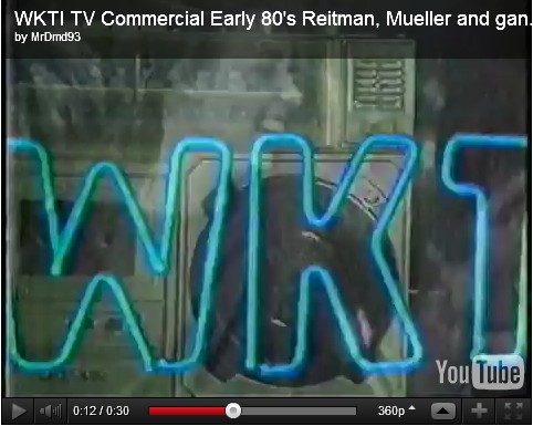
Still nostalgic thinking about the old days in Milwaukee radio, I’ve been hanging out consuming The Halcyon Daze (I prefer using the “classic” interface for navigation, in case you visit here, Scott Beddome — aka rock’s Scott “The Kid”). I’m particularly smitten with this post of 1984 TV commercials for radio — especially this classic WKTI spot:
Not only does it feature Reitman & Mueller, and the Booze Brothers — but that’s Warren Wiegratz on the keyboards!
Having stalked Oceans for years, I’d know. My Oceans following began in 1984 or so, when my biological sister’s foreign exchange “French sister,” Christine (Oh, so tempted to talk trash about Christine and her visit; but I will behave.), came to stay with us and she wanted to hear a jazz band. So my parents took her to Sardino’s. After an early crush on Duane Stuermer (somewhere around here I have signed ticket stubs from Duane, and, possibly, his brother Daryl), I eventually forged a friendship with drummer Ernie Adams — who’s dad, it turned out, worked with my mom. Small world. It became even cozier when Ernie and and dated; but I don’t like to kiss and tell. *wink*
This is a vintage WKTI Tailgator pinback from 1983, featuring Old Style beer. It’s mere 1.75 inches, but oh the size of the memories it unleashes…

If you’re of a certain age — and from the Milwaukee, Wisconsin, area — you remember this era of WKTI, Reitman & Mueller — and the uncomfortably named Jim “Lips” LaBelle.
Thinking of WKTI reminds me of the days our family ventured into the retail business. We bought into the Just Pants franchise, running the Just Pants store at Southridge Mall, then a Taubman Mall (Taubman married and divorced from Christie Brinkley, a rather too present icon of my life, helping me date nearly anything).

Our biggest Just Pants competitor was the County Seat — and Kohl’s department store (which bled we specialty jean stores to death by using Levi’s and Lee denim loss leader sales). Anyone else remember the days of denim walls so high, sales staff used ladders to reach the goods? That’s the pun behind this sexy Just Pants ad — it predates when we had our store (and I doubt we would have ran the ad ourselves, even if it had been in the creative pool of franchisee options.)

Anyway, in that era we not only often played WKTI in the store but we special ordered and custom hemmed Bob Reitman‘s black boot-cut Levi’s. Yeah, we were that cool.
Back then, we not only played whatever radio we wanted in the store, on July 13, 1985, we played the Live Aid broadcast in the store. I called in from the store to donate, getting myself an official Live Aid t-shirt. (They were out of my size, so I received a size small which wouldn’t have covered The Girls and so it has remained safely packed away all these years.)
Now, WKTI is WLWK, “Lake FM.” (Reitman’s still kicking it on air with his weekly show, It’s Alright, Ma, It’s Only Music.) And, ironically, Lake FM sounds almost like an auditory time capsule of the Reitman & Mueller days. I know, I’ve listened to the station when I’ve traveled home. Old habits die hard and my fingers still “dial” to the stations I recalled. Not that any of them are there anymore. Lazer 103, QFM, LPX… All long gone. Apparently, after I moved from Wisconsin, the radio station marketplace went to hell. I’m not the only one who’s more than nostalgic; check out 93QFM: The Halcyon Daze for Milwaukee Rock Radio DJ Stories.
This got me thinking about the other radio stations & DJs… And the connections to retail.
Marilynn Mee, aka Jackpot Girl, part of Bob And Brian’s morning show on Lazer 103 (Mee may still be on WKLH?), was someone I met quite often when I was working at the Estee Lauder counter at Gimbels. Mee was pals with Pam, who worked Lancome. I envied Mee her wardrobe of all things. But then, if you’ve ever had to wear the cosmetic girl garb, well, you’d understand it. Hard to feel 80-‘s glam when you’re wearing a turquoise smock-tent, no matter how fab your face and hair look. (Despite the fact that Marilynn and Pam partied with rock stars, I was the good girl who found herself knocked up; an entirely different subject, and I’ve digressed too much already.)
Because I’m all nostalgic about radio…
My first radio love was WOKY — and AM station that then played top 40 pop stuff. It came in loud and clear on my red ball Panasonic R-70 transistor radio.
![]()
I would turn the volume up and dance madly in the back yard. My most vivid memory is of cranking up Billy Preston’s Go Round in Circles and dancing on top of the old wooden picnic table. So not safe, I’m sure, even if you weren’t dancing yourself dizzy goin’ round in circles. Ahh, those were the days, though.
http://www.youtube.com/watch?v=un63LEAN22E&noredirect=1
Image Credits: Vintage 1970 Just Pants ad via Ads-Things4Less. Panasonic photo via ebyauctions.
This vintage matchbook was from the Curtiss Tavern, “on Hi-Way 57 at Plymouth, Wisconsin,” Carl Senglaub, Proprietor. If features a cute little pinup, “The High-Way,” on the front cover. (Which also prompts me to make a pun about “My way or the high-way.” But I’ll try to resist!)

On the inside, there’s a promotion for the bar’s sandwiches and miniature bowling alleys — as well as a joke about women:
God made man and rested –
God made earth and rested –
Then God made woman –
Since then, no one has rested.

“For Extra Fun Take More Than One” I think they meant the packs of Coke, not women… Of course, I could be wrong; you know how compelling men find a set of twins. Sublimely subliminal. Via.

Making Democracy Work & Grow: Practical Suggestions For Students, Teachers, Administrators, and Other Community Leaders, from the Federal Security Agency, Office of Education, Bulletin 1948 No 10, Oscar R. Ewing, Administrator, John W. Studebaker, Commissioner.

A more subtle Cold War publication, preaching that we must do more than “learn the values & working habits of democracy,” we must “live it” to “strengthen national security and to win the peace.” “We must also work together — to keep democracy free and make it strong and positive.” On the last page, advice on “cooperating” with the Motion Picture Council to “encourage the showing and reshowing of movies that stimulate an understanding and appreciation of American democracy” in your own community. Other media is included in this vintage propaganda booklet; but the film section rather covers it all — the seemingly benign advocacy setting darker things in motion…


Found in a vintage Pennsylvania Turnpike System brochure (circa early 1950s), this photo is actually captioned as follows:
“Freshening up” in a comfortable rest room
I’ll admit I was drawn to this vintage paperback because of the cover. Spotting the sad little sweater girl, I thought to myself, “Why so glum, chum? What can happen to a pinup wearing a pink sweater? …Aside from the cruel misogyny of the world, that is.” But Police at the Funeral is a vintage murder mystery book, so there are larger crimes to come. (That’s why there’s a limp bound wrist illustrated on the cover; it’s not a BDSM book. *wink*)

Oh, and when I flipped through the book, I found this little goofy thing:

Who can resist a murder mystery with a sideways smiley face, of sorts, supposedly as a clue?
Since I was lured in by the pulp-esque cover, I had no clue as to the work or the author, Margery Allingham; as I typically do when I have no clue about the book, I scanned the covers and the copyright page for more clues. My copy is the second printing (April 1967) of the Macfadden publication (MB book #60-280). However, the work was originally published and copyrighted in 1931 and 1932, by Doubleday; which, I later discovered, was a later US publication of the original work put out in the UK in 1931 by Heinemann. So basically, what I have is a later reissue with a more “mod” retro pulp packaging, designed to lure new readers to an old (by now cheap) story. A tradition long upheld in publishing — one that obviously still works, as I’m a modern example.
Aside from being of interest to book collectors, fanciers of the book publishing industry, and the odd duck who cares about my behaviors, the dates of the work are important in terms of the review. For the book has that “formal” tone one oft equates with “old mysteries” — both from the British author and the time period standpoint; i.e. the book reads much like those of Agatha Christie, who was Allingham’s contemporary in what is now called the Golden Age of detective fiction.
The basic non-spoiler story is this: Albert Campion is called in by a friend to investigate the disappearance of a man. The man is found — dead. And so Campion winds up investigating by staying at the victim’s family home, the very “Gothic” Socrates Close, in Cambridge. Socrates Close, and the Farraday family it houses, are relics of Victorian times and mores. (The book’s title, Police At The Funeral, is a reference to the deep embarrassment felt by the scandal of murder; similar social rules regarding gender and race are also present.) More mystery, mayhem, and murder ensues until Campion solves the case. Here’s the back of the book for a full cast of characters:

Usually, I have the “who” in whodunit figured out quickly; one of the many reasons I’m not a huge reader of mysteries. But I’ll admit that I didn’t see this one a-comin’. Perhaps this is because, as Inspector Stanislaus said of the culprit and the culprit’s deeds on page 203, the book has “the right mixture of cleverness and lunacy — an elaborate, ingenious scheme.” However…
While not deducing the murderer (early on or at all) is one of the delights of reading a murder mystery novel, I found myself not caring so much.
Firstly, I found myself not caring so much because, formal tone and style of the work or not, I found the characters cold — cold enough that I didn’t particularly like any of them. So even though my morality demands that the criminal be caught, I didn’t so much worry who it was, why they did it, or what the effects of discovery might mean. And those, for me, are required parts for enjoyment of reading such novels. For even if I do figure it all out on page three, I still (hope to) enjoy the character driven consequences of discovery. In this book, this was absent — save for the unique personal gift Campion receives for a job well done: an antique (even then!) gaff taxidermy mermaid skeleton.
Secondly, I found the most interesting and engaging mystery to be that surrounding Albert Campion himself. There are subtle references, most often from the wealthy Great Aunt Caroline Farraday, that Campion’s real name and identity will be kept — even though there are a few clues here and there… Right up to the end of the book, where Great Aunt Caroline mentions that his grandmother is “dear Emily.” This was the mystery I was more concerned with! And it turns out, fans of the author and her works are too. Now that I’ve read the book, I did a little detective work of my own (research) and learned that not only was Police At The Funeral Allingham’s fourth novel with Albert Campion, but the character would eventually go on to feature in a total of 17 novels and over 20 short stories — and at no point is Campion’s true identity given! Now there’s the mystery worth solving! Perhaps 16 more novels and all those short stories later, I could piece a thing or two together…
Thanks to Allingham’s decent writing, I might consider such an endeavor — if only time were infinite. For I have sagging bookshelves awaiting me…
Speaking of sagging bookshelves, I’m willing to divest myself of this one now. You can buy it from me using the button below for just $6, including US shipping. Or you can try eBay or Amazon.
Since I’ve now finished the book, I’ve allowed myself the opportunity to look up the author, and found that she was cheekily self-aware enough to say that she had “a figure designed for great endurance at a desk.” I sincerely take that to heart. For more on the author, see The Margery Allingham Society.
Perhaps today’s right-win conservative evangelists are only following the advice of Dorothy C. Haskin in God In My Kitchen: Fifty-Two Thoughts For Homemakers (copyright 1958, Warner Press, Anderson, Indiana)…

In chapter three, Beauty, we find the following:
Sheer physical good looks do not necessarily go together with excelling character or outstanding achievement. Our most handsome presidents were perhaps Warren G. Harding, James Buchanan, Franklin Pierce, and Chester A. Arthur. None of these are rated by historians as among our top national leaders. The presidents most praised by historians were not handsome men. George Washington was pock-marked. Abraham Lincoln’s rugged features are well-known and Theodore Roosevelt was bristling in appearance. Parent will do well to mention these things, because many children worry about their looks.
So I guess, by the laws of logic one should be voting for “ugly” candidate?
But that depends upon your definition of beauty; thankfully, Haskin helps with that.
Beauty is something which every girl can have. A young girl was praised for her beauty. Privately her father told her, “People are not praising your beauty, but your youth. You can take no credit at all for beauty at sixteen. But if you are beautiful at sixty, you can be proud of it, for it will be your character which has made you beautiful.”
Way to connect with your daughter, dad. Yeah, there’s some truth in that, but talking about her future old crone status is sure to help her in high school — because you know every high school kid thinks they’ll be dead before they reach the old age of 30. Sixty? What the hell is that?!
But I’ve shown poor character and interrupted Haskin again.
True beauty shows when your face is in repose. The natural expression reflects character. It may be fretty, quarrelsome, or reveal a spirit at rest with God. Another time that true beauty may be seen is when you greet someone. If you are self-centered, your greeting is without feeling and does not light your face. But if you are genuinely friendly, your greeting of others will bring a radiance to your face.
A Quaker woman’s recipe for beauty was:
“Use for the lips, truth… for the voice, prayer… for the eyes, pity… for the hands, charity… for the figure, uprightness… and for the heart, love.”
Because everyone talks about how beautiful Quaker women were! Seriously, I’m not a religious person (shocker!), but most of that sounds pretty nice and pretty sane to me — get it, pretty nice? Pretty sane? lol
Anyway, because I’m not religious — and because I’ve had my fun’s worth of this book, I’m giving it away.
There are many ways to enter; options. But you need only do one, if that’s all the effort you wish to put into winning… And no, I don’t care if you want this vintage homemaker’s book for ugly or pretty reasons. Just enjoy it!
* Follow me on Twitter: @DPopTart. (Please leave your Twitter username in your comment so I can check.)
and/or
* Tweet the following:
I entered @DPopTart’s contest to win a FREE copy of God In My Kitchen http://bit.ly/n7fIhz
(Remember to come back here and leave a comment with your tweet for me to verify.)
You may tweet your entry once a day.
and/or
* Friend me on Face Book: Deanna Dahlsad. (When making the request, note that you are entering the contest.)
and/or
* Post about this contest at your blog or website — if you do this you must include in your post to this contest post or Kitsch Slapped in general.
(Please include the link to your blog post in the comments section so that I can find your post.)
and/or
* Post your entry as a comment — if you do this, please make sure I’ve got your email address, because if you’re the winner I’ll need your email address to contact you regarding your shipping information.
Here’s the giveaway fine print:
* Giveaway is open to US residents only
* Be sure that you leave your email so that I can contact you
* Contest ends October 10, 2011; entries must be made on or before midnight, central time, October 9, 2011. Winner will be contacted by October 11, 2011, and has 48 hours to respond; otherwise, I’ll draw another name.
Hey, edible underpants, you had competition… The Bachman Pretzel Bikini.

Just $2.50 for a “classy” and “sassy” two-piece bikini of “velvety non-woven material.” I can’t imagine you could swim in it. Nor can I imagine wanting a crunchy edible item of apparel — which the words “pretzel bikini” rather imply. Perhaps non-woven means edible? Plus the obvious “good enough to eat” cliche, which the pretzels then lend to the women, and kids, who wear it…
In any case, what’s the use of such a novelty item that “can be worn several times before you discard it”? Pure schtick promo, that’s definitely in bad taste no mater how you look at it.
Via this post at Found In Mom’s Basement.
No offense to Mr. Vargas, but I think he misunderstood the task… This vintage ad was for “Twin Make Up,” not makeup for “the twins.”

The original artwork by Alberto Vargas goes up for sale at Heritage Auctions on September 30, 2011.
ALBERTO VARGAS (American, 1896-1982)
New Jergens Twin Make-Up, advertisement poster, 1943
Mixed media on board
18 x 14 in.
Signed upper left

Welcome to the long overdue New Vintage Reviews Carnival, edition #8.
In this blog carnival, we review everything from classic film to vintage vinyl, from out-of-print books to games found in the basement — we hope to make the old seem shiny and new again!
If you’d like your review (or one you’ve read) to be included in the next edition, please submit it! If you’d like to host, just contact me (Deanna.Pop.Tart@gmail.com) and put “New Vintage Reviews Host” in the subject line.
Books:
At A Penguin A Week, Karyn reviews The Go-Between by L.P. Hartley.
At { feuilleton }, a review of Joseph Balthazar Silvestre’s Alphabet-album, circa 1843, by John Coulthart.
My review of 1962’s Royal Canadian Air Force Exercise Plans For Physical Fitness, here at Kitsch Slapped.
Film:
At Immortal Ephemera, a review of 1950’s Bright Leaf, starring Gary Cooper, Lauren Bacall, and Patricia Neal.
At Out Of The Past, a review of Garbo’s Ninotchka (1939).
Games:
At Steamboat Arabia, an illustrated review of The Game of Life aka Checkered Game of Life by Milton Brady — first sold in 1860.
Music:
At Scratch, Pop & Hiss, a review of James Luther Dickinson’s Dixie Fried (1972).
At Kitschy Kitschy Coo, my review of Toni Basil’s self-titled album.
At Silent Porn Star (obviously NWS), a review of the 1957 LP My Pussy Belongs To Daddy, which is silly and risque.
At The World’s Worst Records, Darryl W Bullock reviews A Soldier’s Plea by Bishop J M Smith and the Evangelist Choir.
My review of MTV’s High Priority, here at Kitsch Slapped.
And… This last one isn’t truly a review… But in the spirit of living with “old stuff,” surely the story of Phil Cirocco’s full restoration of a Novochord dating from 1940 fits in. (Via Scratch, Pop & Hiss.)
Here’s a little gem: the Royal Canadian Air Force Exercise Plans for Physical Fitness booklet.

This edition is the forty-third printing of the revised U.S. edition of the official RCAF fitness plan, published in 1962. It’s two books in one, as it contains both XBX (Ten Basic Exercises), the twelve minute a day plan for women, and 5BX (Five Basic Exercises), the eleven minute a day plan for men, which were previously published separately. (Note, the “X” in XBX does not refer to the two x-chromosomes of women.)
The plans enable you, the common folk, to get fit just as the fancy airline folk do — by yourself, at home, in your spare time, at your own rate, without any equipment.
I can’t speak to the effectiveness of the fitness plan; however, the exercises, created by Canada’s “pioneer” of physical fitness, William A. R. Orban, look like the general movements, tasks, and poses I’ve found in so many publications over the years (none as bad as beating your fat against a wall). But I can and will speak to the quirky fact that the two fitness plans differ greatly in terms of how the exercises are depicted by gender.
The women’s exercises are shown with step-by-step photographs of women in leotards:

While the men’s are shown with cool, graphic, iconic, illustrations:
 While it’s true that the men’s fitness plan predates the women’s by a couple of years, I still find the differences striking… Was one gender thought to be confused by less-than realistic images? Is the female form just more acceptable, if not titillating, when shown in photographs? Or was continuity broken because greyscale printing became cheaper or otherwise de rigueur?
Before you decide, let me just show you one more thing…
While the men get a great phallic graphic, we women are sans a powerful ovarian homage.

Fingernails have long been symbols beauty — specifically as indicators of wealth. The cleaner, the longer, the more well-manicured, the more they distance the wearer from manual work. Long nails, even if natural fingernails, are unnatural — and the really long “dragon lady” fingernails are sexy because they are so removed from the norm they become exotic.

We may no longer be digging roots out of the ground, grinding corn by hand, or banging laundry against rocks; but (most of us) still wash dishes, scrub floors and type on keyboards — all which wreak havoc with our nails and manicures. And so, whether we “do less work,” pay for our manicures, or just wear gloves to protect our hands, manicures, and pretty hands in general, remain “beautiful” because they and/or the high maintenance of them indicate wealth.
Image credits: Chen-Yu Nail Polish for Vogue, 1939; photographer Horst P. Horst. Via.
These retro red nylon panties would be lovely… ‘Cept I’m not wearing anything embroidered or otherwise marked “Dube Du Special” until I know exactly what that means.

Via eBay.
I’ll admit, I liked this vintage dress more when I thought the Sunkist-orange orbs were oranges, not hats; but passersby would likely make the same mistake and gawking to confirm is one way to turn heads.

Image via TimelessVixenVintage.
So much to absorb here… A sexist display of Native American stereotypes, awesome funky neon signs that appear to highlight the pinup on parade here (“Stump” Hardware, the heat of the Holland Furnace Company, and a V.F.W. post), a big ol’ tuba and an even bigger car… And does that sign mean this display was to promote voting for a senator?
(Vintage photo via Lynnstudios.)


